|| Business Card ||
Calendar ||
Menu ||
Business Card – Creative Concepts
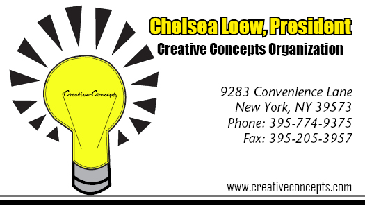
I made the logo for Creative Concepts into a light bulb because light bulbs are often symbols of ōbrightö ideas. I also chose a bright yellow to be the core color because it is eye-catching and relays back to the theme of ōbright ideasö. I added hash marks all around the light bulb to indicate the severity of the brightness. In order to incorporate the name into the logo, I used the ōelectric currentö inside the lightbulb to write out ōCreative Conceptsö in cursive. I thought it was a clever idea, and also a creative idea, thus further reiterating the idea of creativity. I chose bold fonts for the presidentÆs name and title of organization to make it very clear and easy on the eyes. To contrast this, I listed the information about the company in cursive. I also did this because it matched the words in the logo. I felt that this really helped tie together the information, or words, and the logo. It is then very clear that the two are one entity, as opposed to two separate creations placed beside each other. I also made the border of the light bulb thick on the outside and thin on the inside. This minor detail is really eye-catching, in my opinion. I then used the same thick outer line and thin inner line idea for the bottom of the business card and the bottom of the letterhead. This also helps tie everything together, as well as add a little more detail that would be lost if I simply used a thick single line.
Calendar – December
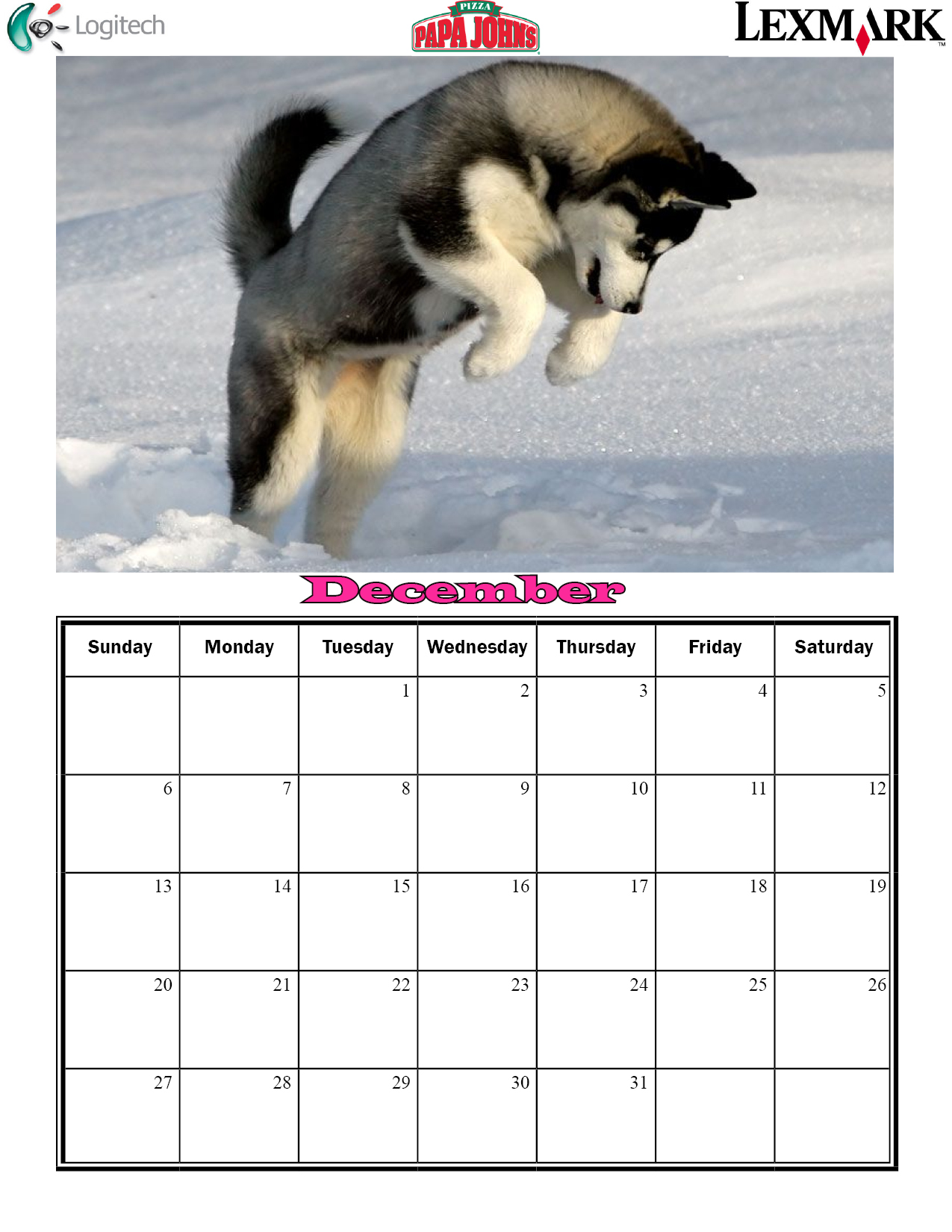 For my calendar, I decided to use eye catching pictures. I went with the theme of animals, and I also tried to match the background of each season to the month in which it corresponded. For example, my December picture of the Siberian Husky takes place when it is snowing, which is perfect for December. I also kept the title of each month in the same font and style to create unity throughout the entire calendar so that it is clear each month is part of a whole (the complete calendar). I used a bold legible font so that it not only pops, but it clear and easy to read, even from a distance. I also chose a font that is wider than it is tall because I used landscape orientation and I wanted the title of the month to stretch across the page as much as possible. I put ads around the borders of the calendar for different companies for advertisement purposes. I also picked a clear, distinctive font for the numbers on the calendar dates. A ōfancyö font would not have been as effective because it would not serve the purpose correctly.
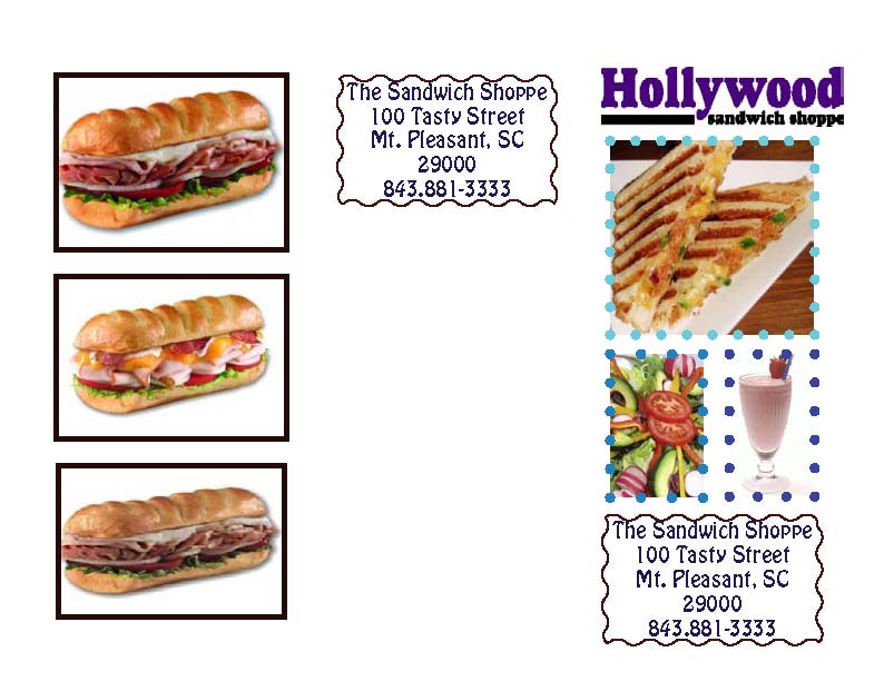
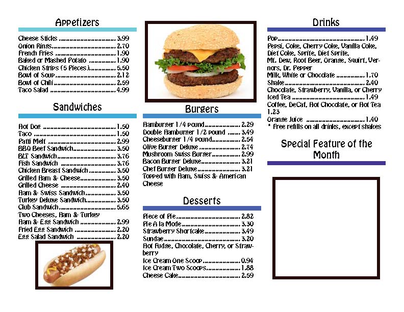
For the cover page, I decided to use dot borders around the pictures because it creates a ōfunö atmosphere and also draws attention to the pictures themselves. I chose three different shades of blue for the border to add variety. I then put a wavy border around the address because I felt like it also had the same effect as the dots border and goes along with the ōfunö atmosphere. For the inside of the menu, I chose the same font I used for the address on the cover in order to create unity between the two pages. To add emphasis on each category, I centered the title and increased the size. That way, these words easily ōpopö and catch the readersÆ eye. I also added a thick line under each title and kept with the theme on the cover page by using different shades of blue. I started with a very light blue and got gradually darker to add a sense of flow to the menu. Even in black and white, you could see the gradient change, which is great if the business can not afford to print in color.